Hello fellow analyzers!!! Today i will be moving ahead with the series ‘DATA SCIENCE FOR PUPPIES’ and showing my analysis on the breast cancer dataset. You can refer to the code directly as i will be showing very relevant information only, so if you want to get all the analysis i did, you can refer the code.
LINK TO CODE: https://github.com/shadow9909/MyDataScience/tree/master/breast%20cancer
The dataset in available in sklearn.datasets so you don’t need to download it separately. Here is the data description i picked from kaggle but i don’t think you want to go through it. Let us visualize pretty curves.
Attribute Information:
-
ID number
-
Diagnosis (M = malignant, B = benign)
3-32) Ten real-valued features are computed for each cell nucleus:
a) radius (mean of distances from center to points on the perimeter)
b) texture (standard deviation of gray-scale values)
c) perimeter
d) area
e) smoothness (local variation in radius lengths)
f) compactness (perimeter^2 / area – 1.0)
g) concavity (severity of concave portions of the contour)
h) concave points (number of concave portions of the contour)
i) symmetry
j) fractal dimension ("coastline approximation" – 1)
Missing attribute values: none
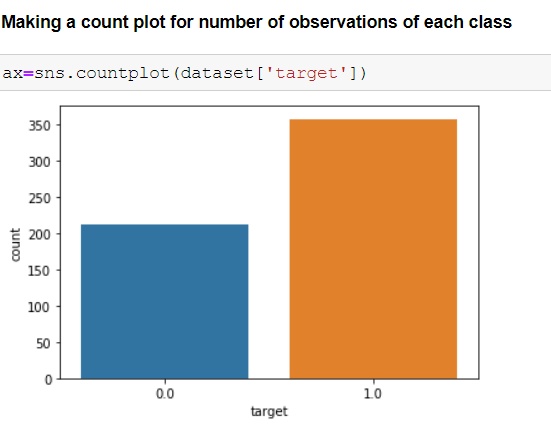
Class distribution: 357 benign, 212 malignant
Let us start analyzing now!!!
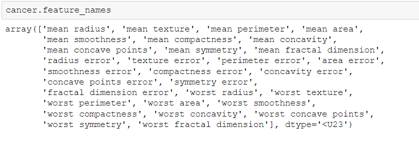
Importing all the required libraries, loading the dataset and looking for feature names.
As we have many features it is important to find the best features among them to make our analysis more efficient.
Using correlation matrix for analyzing
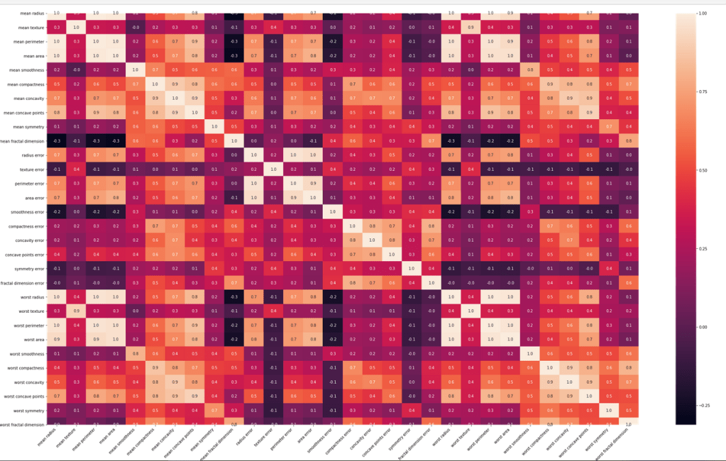
What a trippy heatmap it was!! We have to make other visualizations to get more insights of the features.
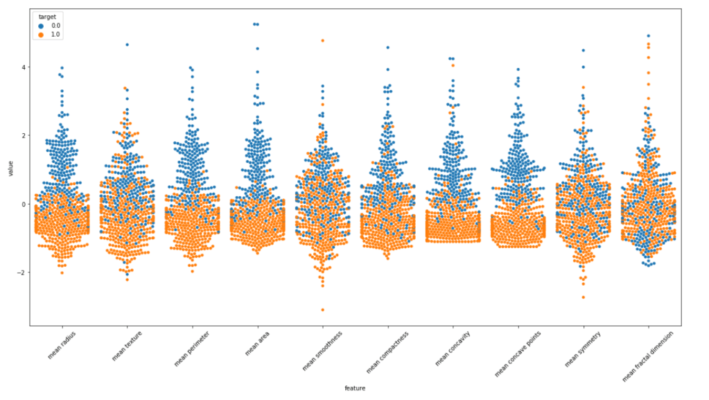
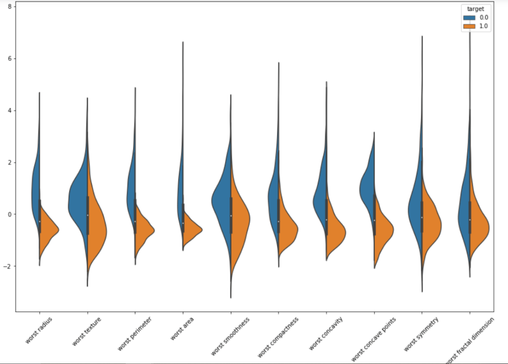
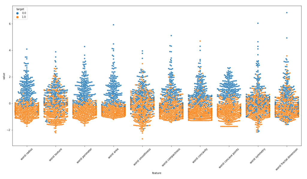
We will make violin plots and swarm plots here to get a better insight about distribution. Normalizing the dataset and then using pandas melt function for visualization. As the number of features are large we are visualizing them in parts.
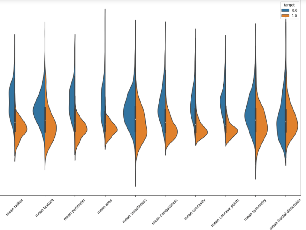
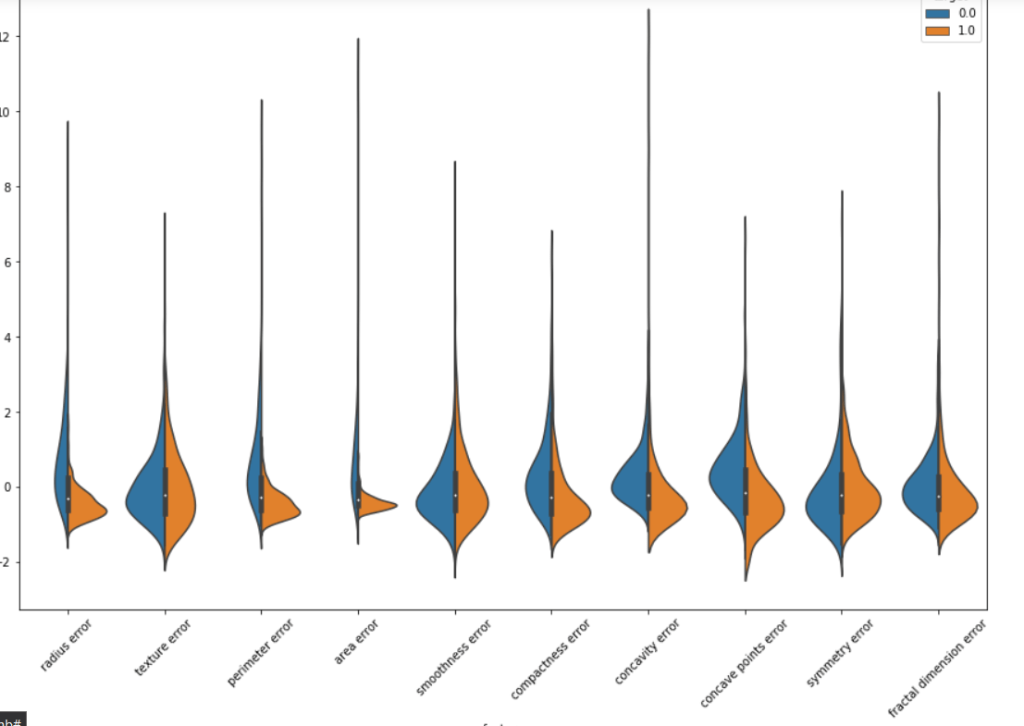
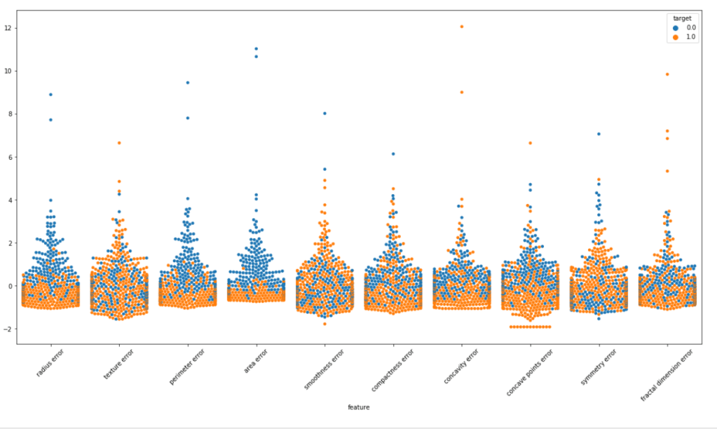
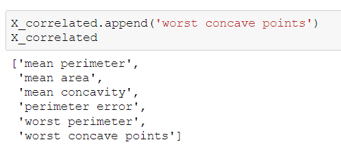
We can surely some distributions which are kinda same. Removing these features may/may not affect the performance. But the features with extremely high correlation score surely affects the model. Let us visualize some pairs of feature to obtain their pearson r value.
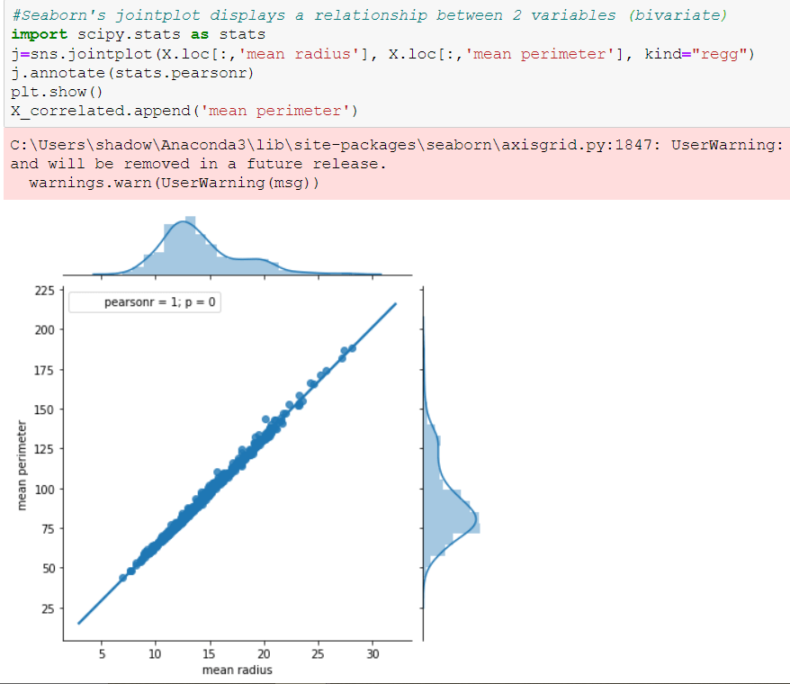
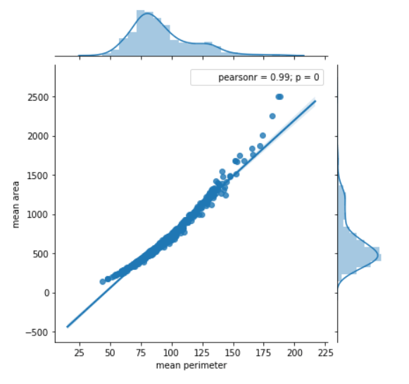
Features with this high pearsonr value should be removed. I tested the model by both keeping and removing these features. It turns out our model responds well with these features removed.
Here is the list of correlated features. You can check for more such features!!
Now should start the more fun part!!
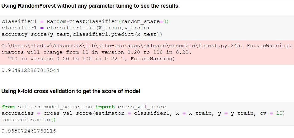
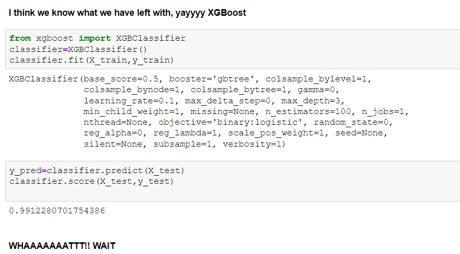
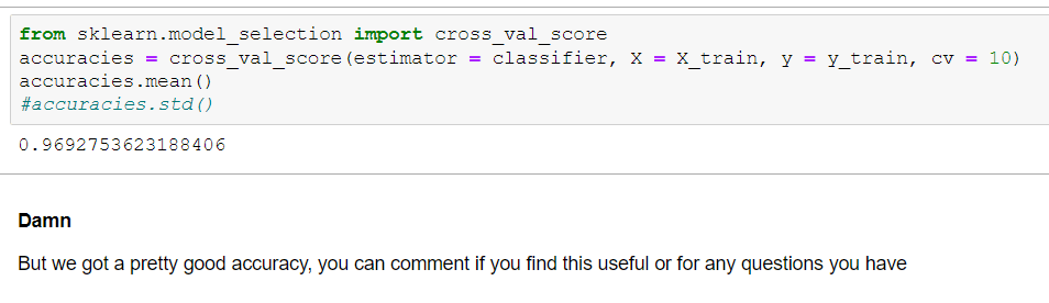
Note: I have tried many other models and applied parameter tuning to them also. I have showed limited and more relevant things here. You can checkout my notebook for briefer outlook.
